ADHS Praxis Neuy-Lobkowicz

Project Corporate Design

Belá Stetzer | Marika Bach

10/2025 - 01/2026

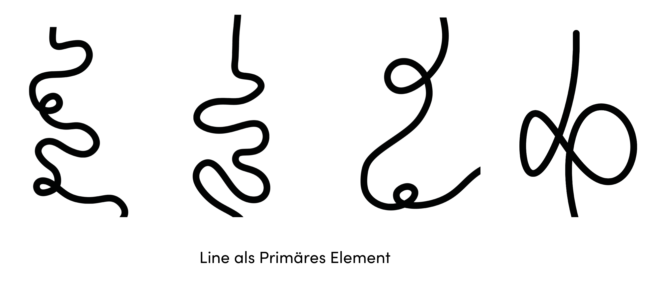
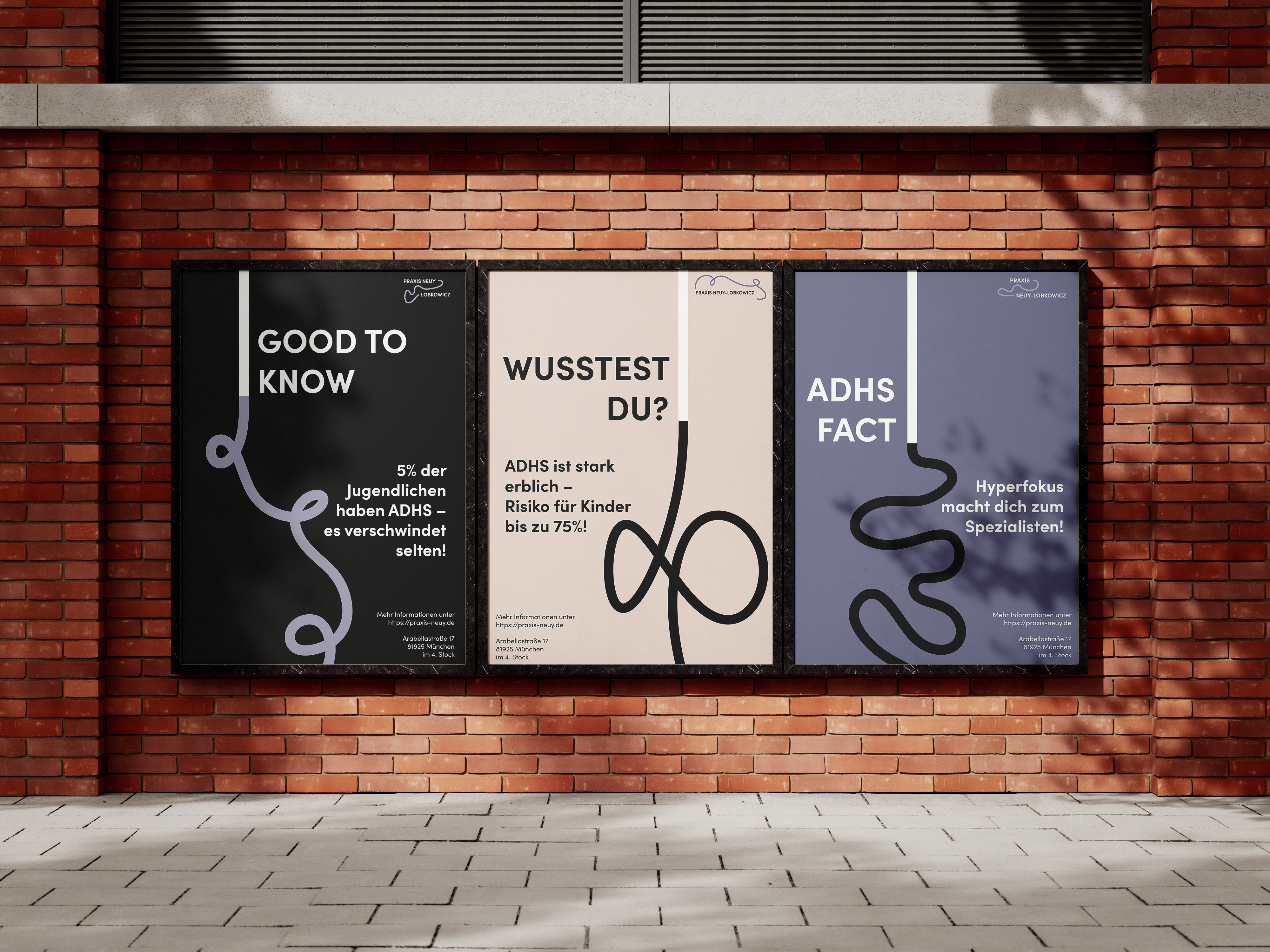
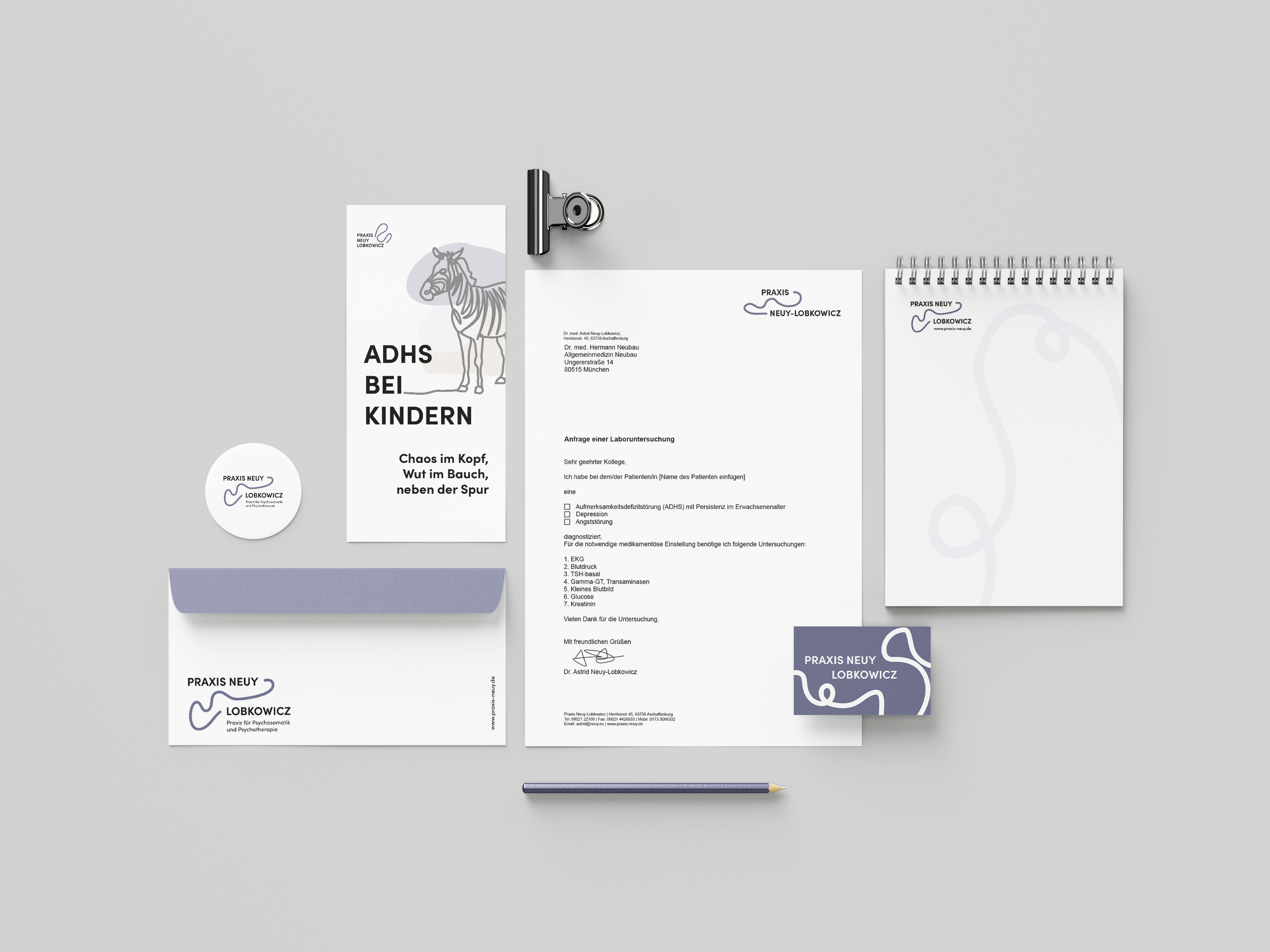
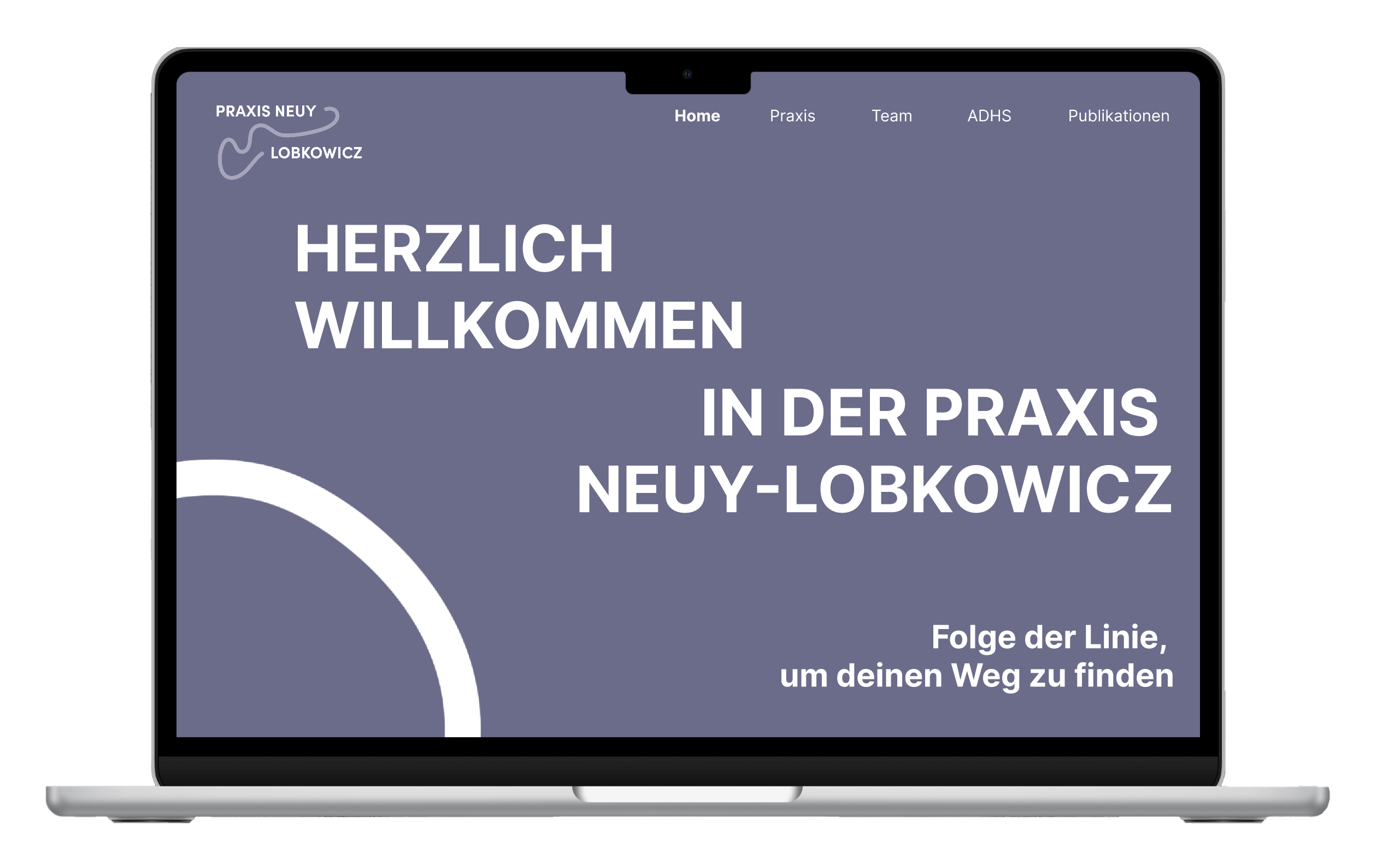
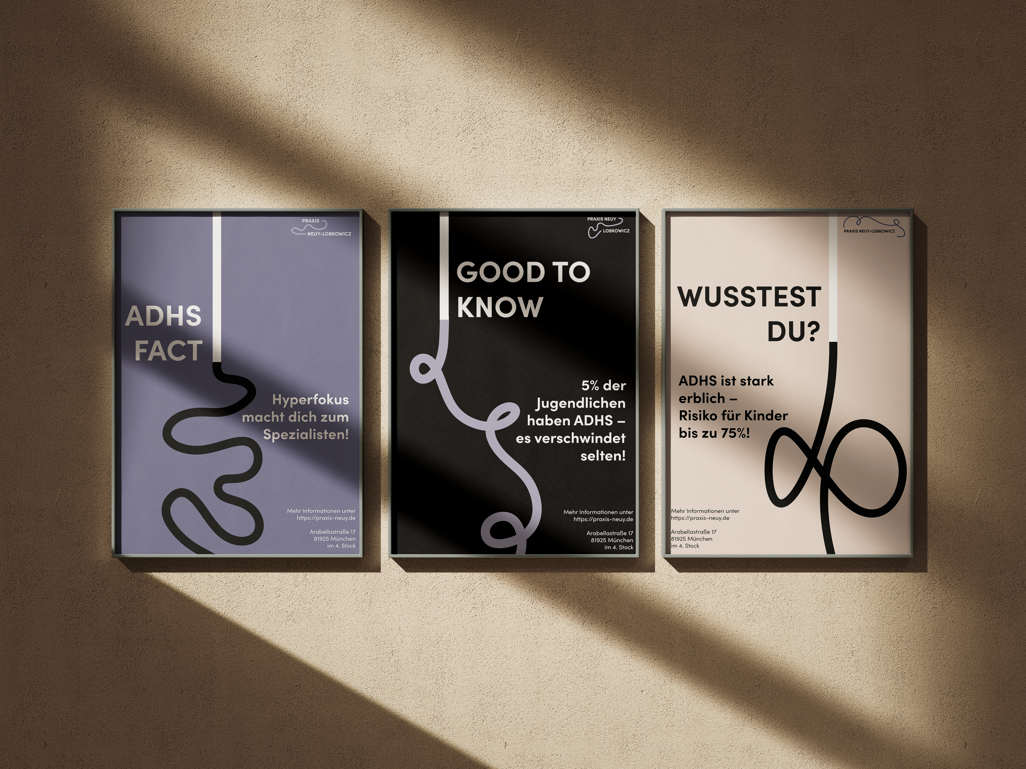
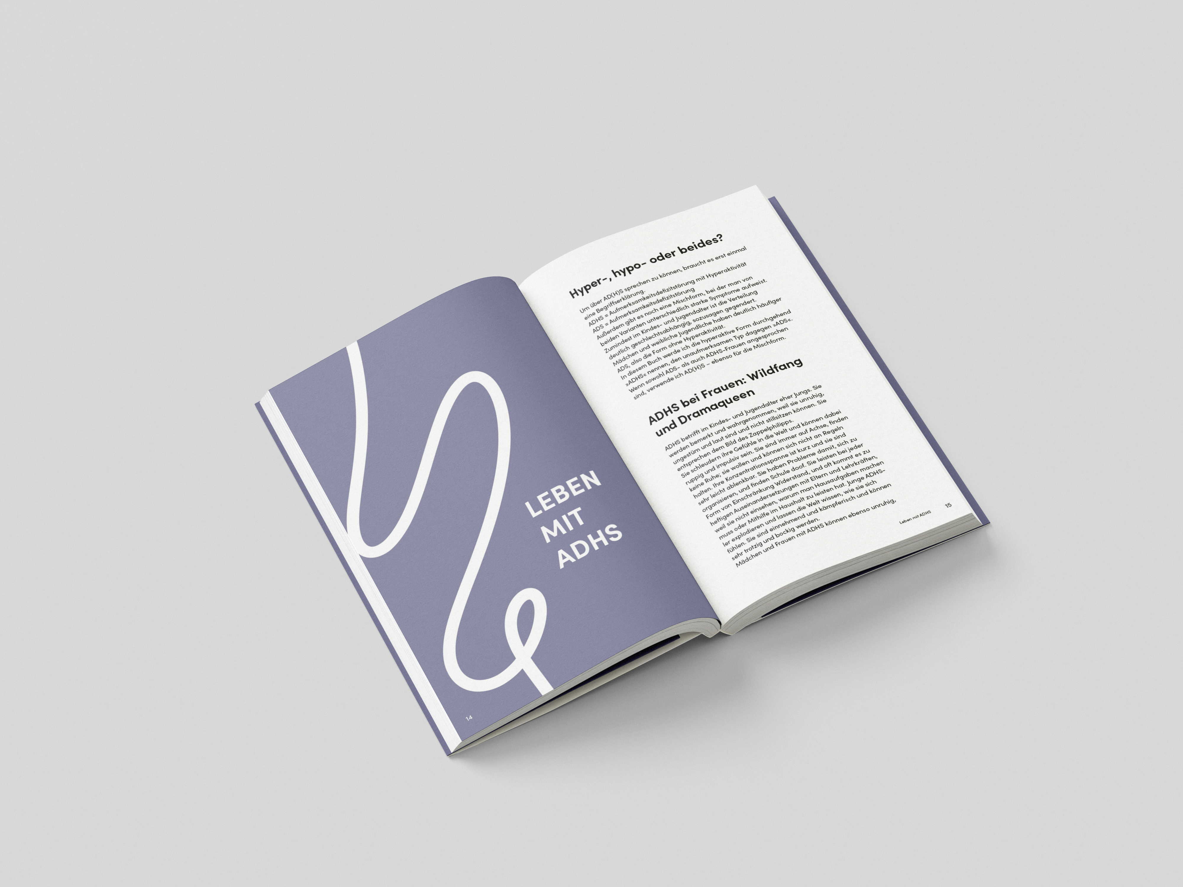
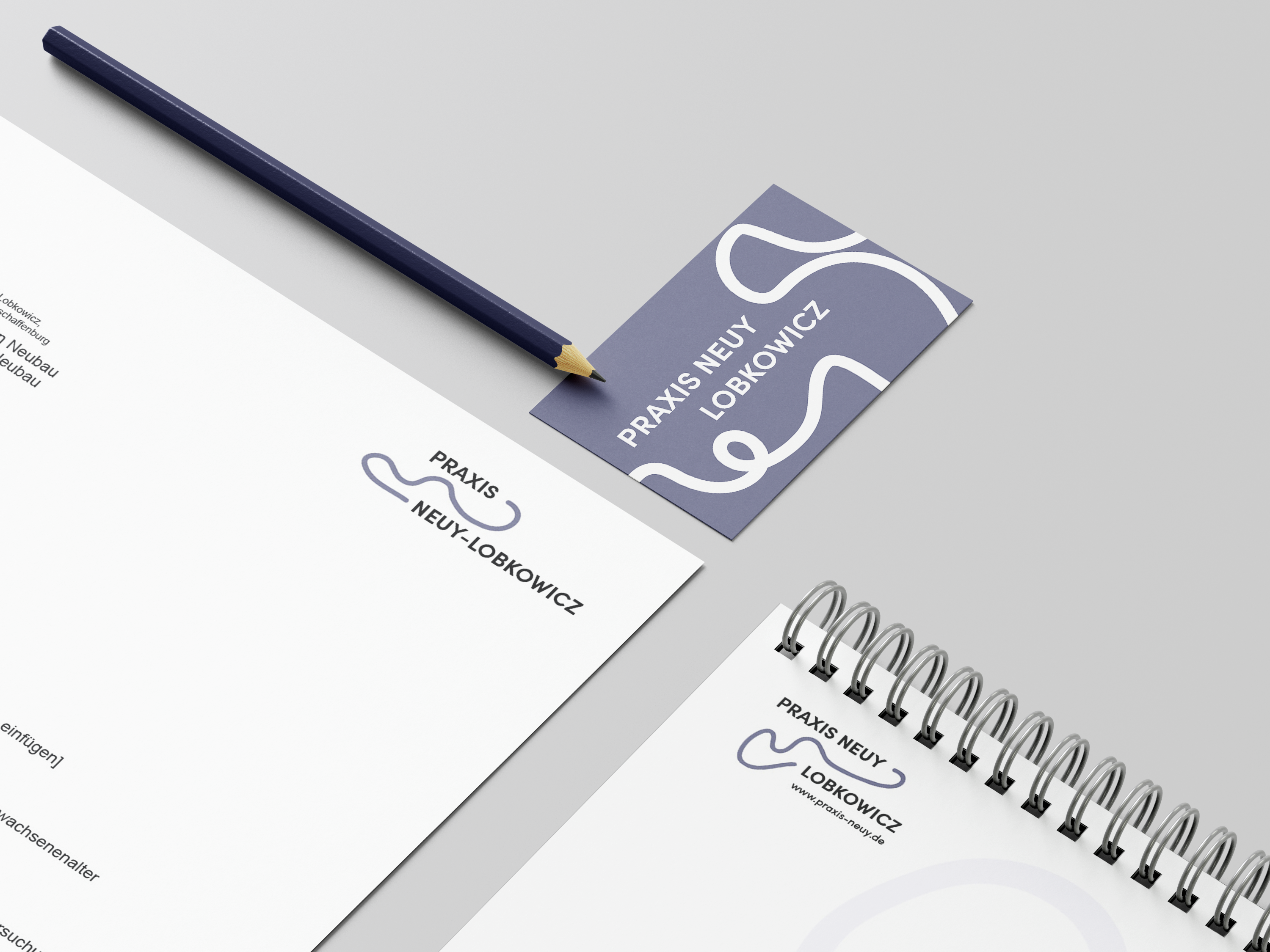
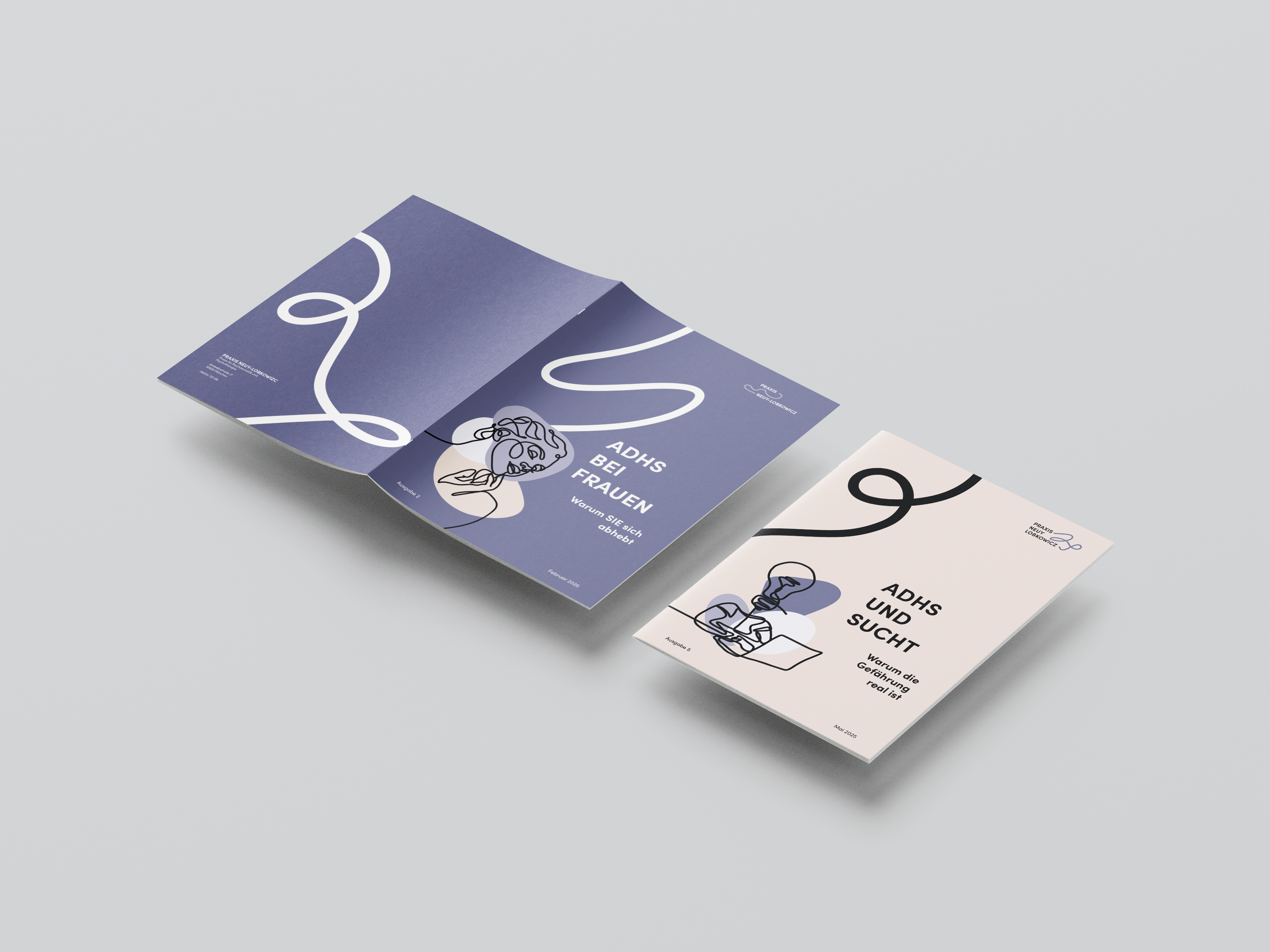
Concept: Why a knot?

Sometimes, thoughts feel like an impossible knot to untangle. Those living with ADHD know this chaos all too well and know how difficult it is to loosen that knot on their own.

This is exactly where my project comes in. Together, we will unravel the tangle of thoughts. Step by step, we create space to think clearly and calm the mind again. For me, therapy means relieving the pressure, regaining focus, and taking back control of your own thoughts.

Projekt Einleitung

Initial situation

Our collaboration began with specialist in psychosomatic medicine and psychotherapy, Dr. med. Astrid Neuy-Lobkowicz. Her vision was a clear yet playful corporate identity that reflects both her professional expertise and her openness. The starting point was an extensive research phase, where we analyzed existing designs and websites to define the right tone for the new project.

Homepage praxis-neuy

Initial situation

Typography

Following the research phase, we moved quickly into the implementation. For the typography, I chose Sofia Pro in various styles for both body text and headers, providing a clean and versatile foundation.

Typography

Colours

The color palette, featuring warm shades of purple and brown, is reminiscent of lilac. It conveys a sense of affection, serenity, gentleness, and sophistication. With its pastel undertone, the palette feels innocent, lovely, and fresh which is a perfect fit for an ADHD practice.

Colours

Visual leitmotif

A recurring line serves as the central visual motif throughout the corporate design. It acts as a golden thread that creates consistency across all touchpoints while simultaneously symbolizing the process of unraveling the knot in the mind of an individual with ADHD

leitmotif

Visual Language

For the visual imagery, I chose One Line Art illustrations because they are congruent with the thread of the leitmotif. It is as if the line decides to create something complex and then becomes calm again, much like images in the mind. Depending on the background, the colors blend into the illustrations to create a connection and highlight the lines.

Visuals

Logo Design

Since ADHD is a multifaceted and diverse condition, I decided that the logo should be just as variable as the disorder itself, allowing for different applications. The name practice Neuy-Lobkowicz, is flexible as well, meaning it can be arranged either stacked or side by side. The line symbolizes the connection between the practice and the doctor, while also linking the parts of the name through an abstracted joiner.

Publication

The overall design concept can be visualized through a book publication, showcasing how all elements harmonize together. Of course, there are variations here as well, which allows for a series of books that symbolize a sense of belonging. Optionally, this concept can be applied not only to hardcovers but also to dust jackets.

Publication

Posters

The poster series demonstrates the versatility of the design concept in a public space. By utilizing the central line as a consistent visual element, the posters effectively bridge the gap between informative content and aesthetic appeal. Each poster highlights a specific fact about ADHD, using the evolving shape of the line to mirror the complexity of the topic. This approach ensures that the brand remains recognizable while adapting to different messages, turning potentially dry medical information into engaging and accessible visual storytelling.

Posters

Business Cards

The business card design serves as a tactile extension of the brand. By utilizing the continuous line as the dominant visual element, it creates an immediate point of recognition. A variable color palette and different line iterations reflect the flexible nature of the practice and its team members. This approach ensures a cohesive and sophisticated aesthetic while maintaining the professional and empathetic tone established across all brand touchpoints.

Stationery

The stationery set brings the visual identity into everyday practice, ensuring a consistent and professional appearance across all administrative materials. By applying the continuous line and color palette to letterheads, envelopes, and notepads, the design creates a cohesive brand experience. This intentional use of space and motif transforms standard office documents into calm and recognizable assets, reinforcing the practice's unique identity in every patient or professional interaction.

Stationery

Website

The website is designed as a guided journey, using a continuous line to mirror the process of untangling complex thoughts. This central motif ensures intuitive navigation while maintaining a calm and minimalist aesthetic. By balancing elegant typography with soft One Line Art, the design transforms a medical topic into an approachable and empathetic experience.

Website Mockup

website

Application and Mockups

To fully illustrate the versatility of the corporate design, I have created a series of mockups showing how the identity functions in real world scenarios. By applying the visual elements across different media, these examples demonstrate the coherence and adaptability of the brand. From digital touchpoints to physical materials, the design maintains a consistent atmosphere, reinforcing the feeling of clarity and professional support that defines the practice.

Summary

The corporate design successfully translates the complex nature of ADHD into a calming and intuitive visual language. By using a continuous line as a leitmotif, the project creates a sense of clarity, empathy, and professional consistency across all brand touchpoints.

BMW Final Mockup